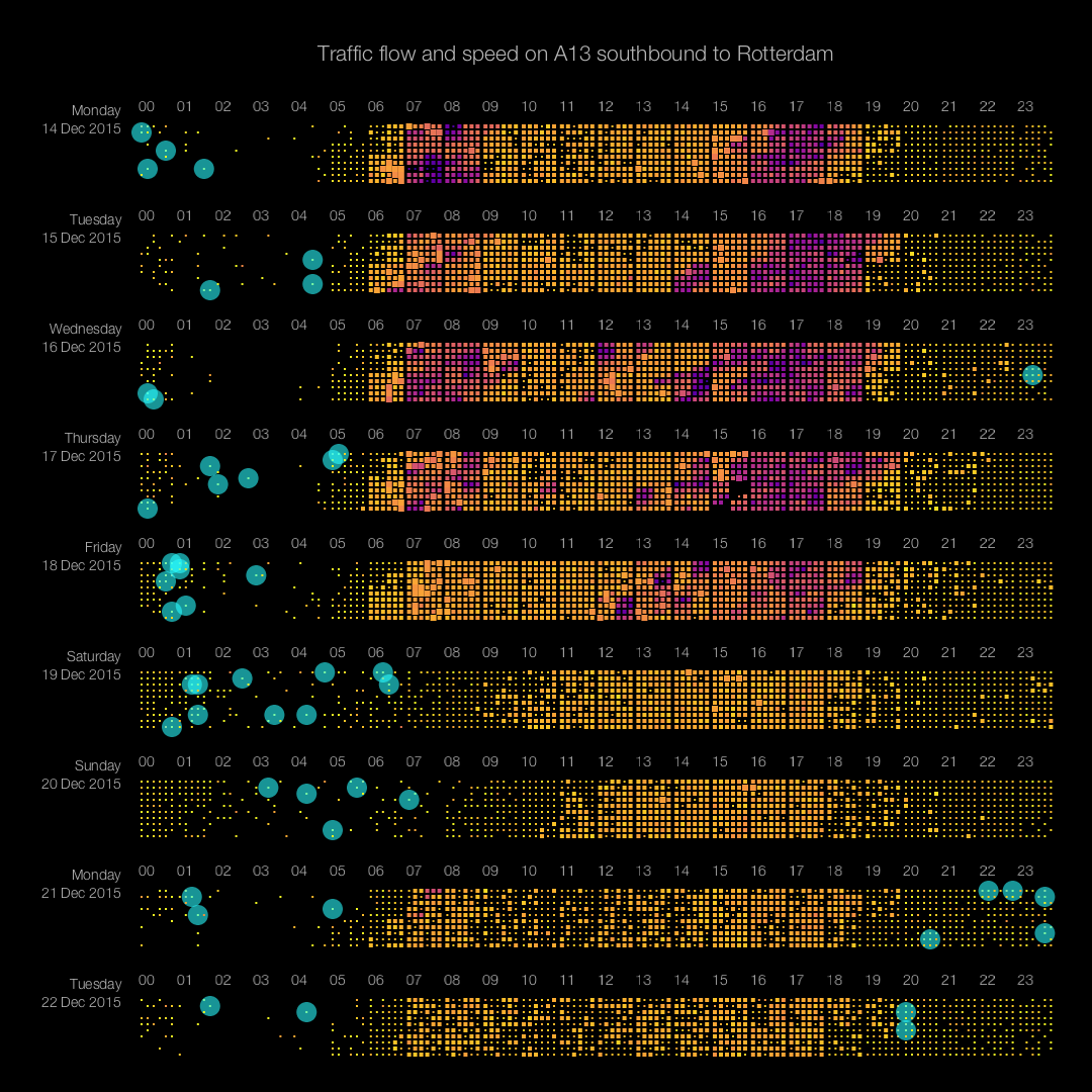
 A pixel plot is a very efficient way of displaying lots of data in one view. Each little rectangle in the image above (click image for full-size version) represents one minute of data. Its color denotes the speed of cars: from yellow (fast) through orange to purple (slow). The size of each rectangle represents the traffic flow, i.e. the number of cars passing per unit of time.
This type of visualization allows for spotting trends and anomalies in the blink of an eye. The image reveals patterns like traffic jams (the purple areas), times with high traffic flow (bright orange area’s), missing data (Dec 17th between 15:00 and 16:00), difference in traffic between weekdays and weekends, and difference in traffic between non-holidays (e.g. Monday 14th) and holidays (e.g. Monday 21st). The circles indicate speeds over 150 km/h (!) where 100 km/h is allowed.
This work was done for the TU Delft in the Social Glass project. Please read my blog explaining in detail the process followed to create this image.