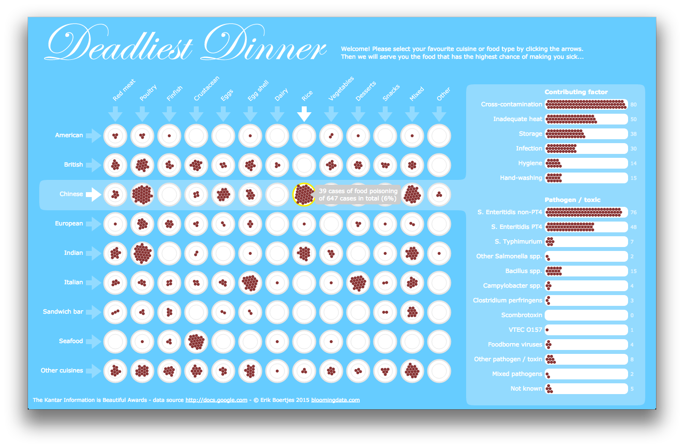
This interactive data visualization is my entry for the Kantar Information Is Beautiful Awards Challenge. It shows data about restaurant-associated food borne outbreaks reported in England and Wales from 1992 to 2009. By selecting either a cuisine (American, Italian, Chinese, etc.) or a food type (Poultry, Eggs, Dairy, etc.) the tool shows the combination most likely to get food poisoning. In addition, the visualization shows, per cuisine, what the most likely cause of food poisoning is (e.g. inadequate heating, bad hygiene) and the type of bacteria involved.
Click here for the interactive version.