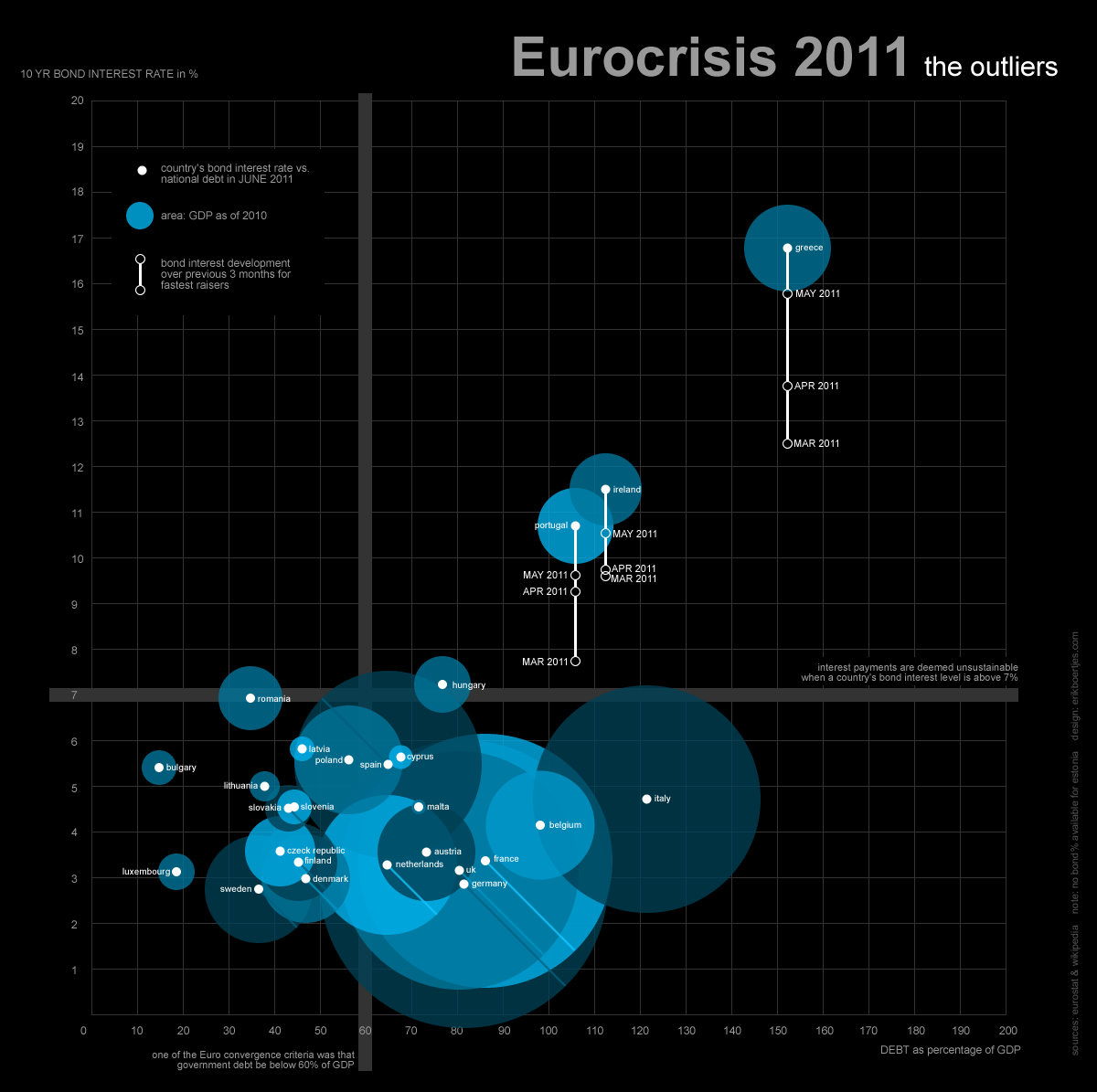
 This was my submission for the ‘Money Panics’ visualization challenge as part of the Information Is Beautiful Awards. (Click the image for a full-size version.)
Two of the criteria for being a financially healthy country are the country’s 10-year bond interest rate (the higher this rate, the more expensive it is for a country to borrow money), and its debt (as a percentage of its gross domestic product). The European countries agreed to keep their debt below 60% of its GDP (which most of them did not succeed). In addition, if a country’s bond interest rate exceeds 7%, that country’s financial situation is in trouble. So those countries with high debts, having the pay high interest rates are the outliers in this story: they are in the top right quadrant of the visualization.
Fortunately, each of them have a relatively low GDP (as reflected by the blue sphere’s size) which means that the EFSF (the European Financial Stability Facility) still may be able to help them out. To show how fast these countries’ interest rates have been growing, I plotted the interest rates of the past months along the white vertical lines.
The data was provided by Information is Beautiful Awards. I took some additional data from the Eurostat website.