One of the projects I’m working on at TNO is about looking at how people influence each other on social networks. For this, we gathered a lot of Twitter data using their search and streaming API’s. My job was to visualize that data to get some feeling for it.
One of the datasets contains all Tweets that were sent during a TV program (‘The voice kids’, yet another talent show). The image below (created with Gephi) shows a node link diagram with the nodes representing the Twitter users that send one or more tweets during the show. Two nodes are linked if the user represented by one node retweeted the user represented by the other node. Thickness of the edges depend on the number of time person one retweeted person two. To visually separate the sub networks I colored each node according to its out degree: large subnetworks turn yellow, smaller ones blue.
The above image only shows users, not the actual tweets. In addition, the time aspect is missing. The next graph, based on a different dataset, plots all tweets of CNN during one month, and all the retweets of those tweets. It tries to show how fast and far a message from CNN spreads in twitter. Time is plotted vertically, increasing from top to bottom. The number of hubs a tweet takes is plotted horizontally: retweets of a CNN tweet are plotted in the left column. Retweets of those retweets are plotted in the column next to it, etc. The rightmost column shows tweets that have taken three hubs: a CNN tweet was retweeted by person A. Person B retweeted the retweet of person A. Person C retweeted the retweet of person B. That way, the original message spreads far in the Twitter network, not only reaching the followers of CNN, but also those of person A, B and C.
The next visualization (‘retweet bars’) is based on the same type of data: all tweets of a specific user and all retweets of those tweets. The focus here is to see how fast messages from a certain user spread through the Twitter network, and how long a message survives, i.e. is still being retweeted.
Each tweet of CNN is represented by a grey bar. The start of the bar (left) is the time the tweet is sent, the end of the bar (right) is the time of the last retweet of the tweet. Retweets are plot as dots in the bar. Circles around each retweet reflect the number of followers of the retweeter. The complete visualization is quite large (shown here for another Twitter user: Y_U_NOOO):
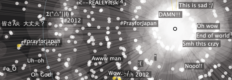
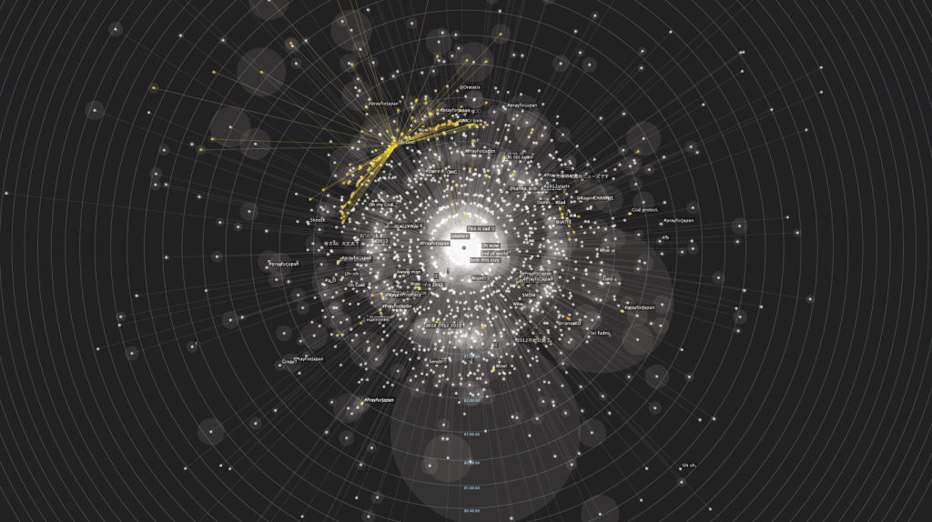
Finally, I made a visualization of all retweets of one specific tweet. I put the tweet in the center and arranged all retweets around that tweet. The distance between retweet and tweet indicates the time between tweet and retweet. So retweets that were sent shortly after the original tweet is send are close to the center, retweets that were sent with larger delay are further from the center. The figure below shows the visualization for the tweet “A 7.0 earthquake hits off Japan’s southern coast, according to the U.S. Geological Survey. No tsunami warning issued.” sent by CNN on January 1st 2012 (so this is not about the 9.0 earthquake in March 2011). This tweet is the black dot in the center. All white dots are retweets of this tweet. Yellow dots are retweets of retweets. The text next to some retweets are words added by the retweeter to the original tweet. White transparent circles behind each retweet show an indication of the number of followers of the retweeter. (Click image to enlarge).


